The Story Behind Our Logo
Dr. Kerin Orbuchs’ logo represents the image of a guardian angel. Dr. Kerin Orbuch strives to be a caring, healing, and comforting physician as she acts as her patients’ guardian angel. The angel wings also represents Los Angeles, the City of Angels.


Her logo/symbol has multiple meanings:
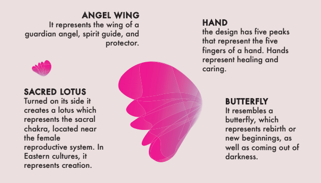
Angel Wing: guardian angel, spirit guide, protector, ally
Hand: the design has five peaks that represent the five fingers of a hand. Hands represent healing and caring. People use their hands to hug, hold hands, and caress loved ones.
Butterfly: the design also resembles a butterfly, which represents rebirth or new beginnings, as well as coming out of darkness
Bougainvillea: its shape, subtle transparency and more notably the magenta color of the design is inspired by the bougainvillea. The plant is commonly spotted around Los Angeles, the magenta bract (often confused with a flower) is associated with the reproductive structure, these magenta colored bracts are specialized leaves that grow around flowers, mother nature designed these colorful leaves to attract pollinators.
Sacred Lotus: If you turn the symbol 45 degrees counter-clockwise, it creates a sacred lotus which is hugely symbolic in eastern philosophy and Traditional Chinese Medicine. It represents the sacral chakra which is located near the female reproductive system; and in Buddhism the sacred lotus represents creation and cosmic renewal.
Color: the color is both gradient in hues and semitransparent which communicates “delicate” …Iris is delicate towards her patients… patients will be treated gently. The symbol starts off in a violet hue but quickly transitions into magenta.
Connect with Dr. Iris on social media: @dririskerinorbuch or @iriswings
@dririskerinorbuch
@iriswings
@dririskerinorbuch
Phone: (310) 651-7333 Office: 9001 Wilshire Blvd. Suite 207 Beverly Hills, CA 90211
PHONE:
(310) 651-7333
OFFICE:
9001 Wilshire Blvd.
Suite 207
Beverly Hills, CA 90211

